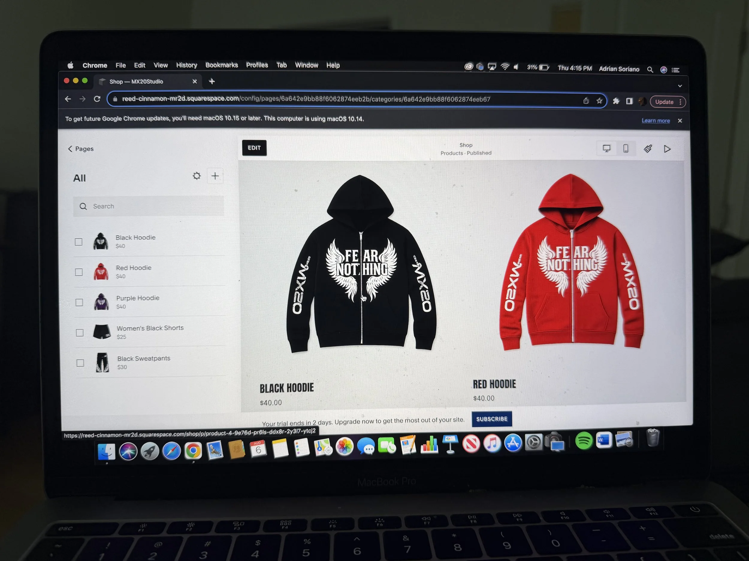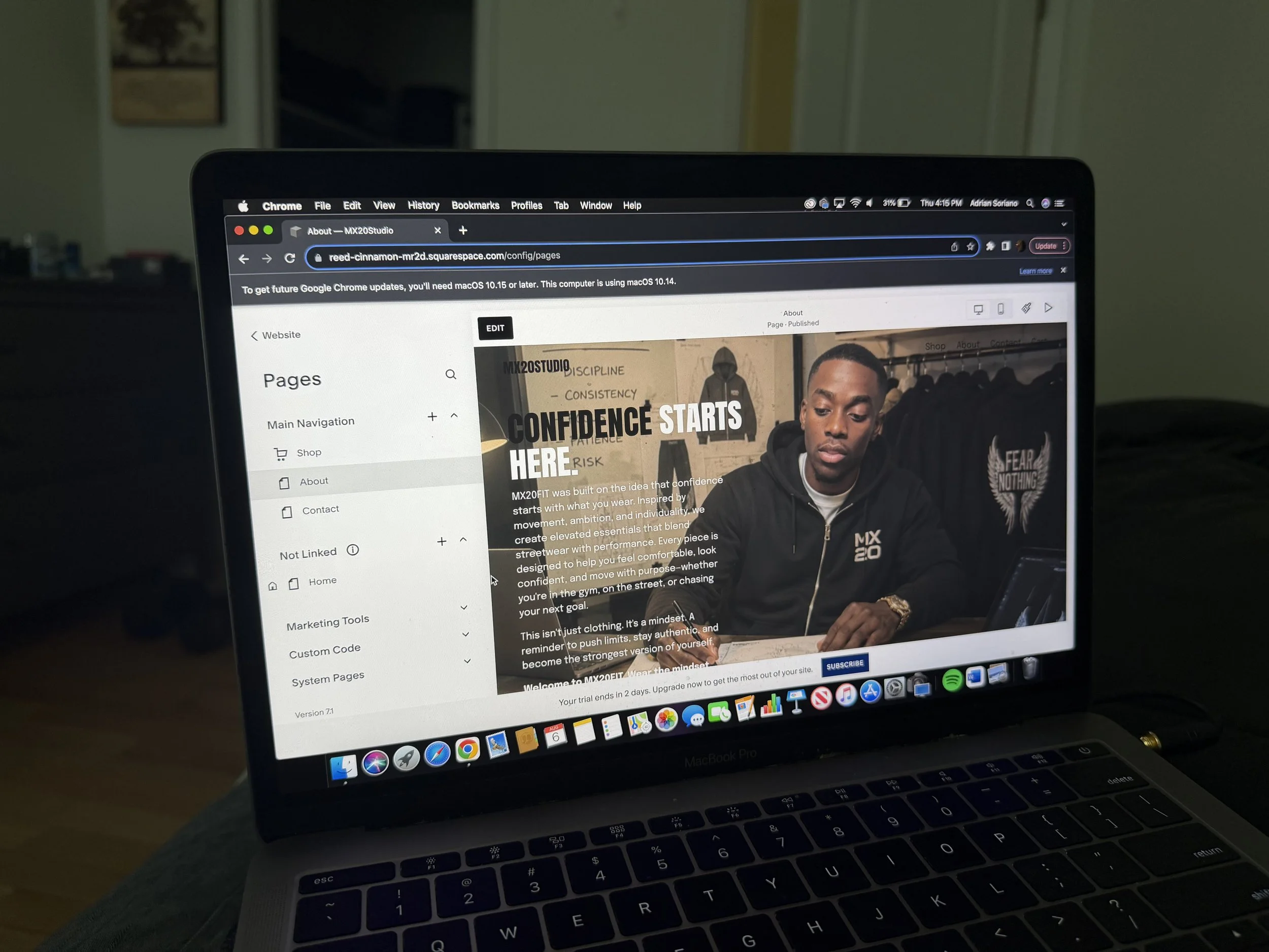
MX20FITBrand Identity & Digital Experience
MX20FIT is a fitness brand built around performance, discipline, and longevity. I created a full visual identity, website, and content direction.
CREATIVE DIRECTION
BRANDING
WEB DESIGN
CONTENT CREATION
01 / BRAND IDENTITY
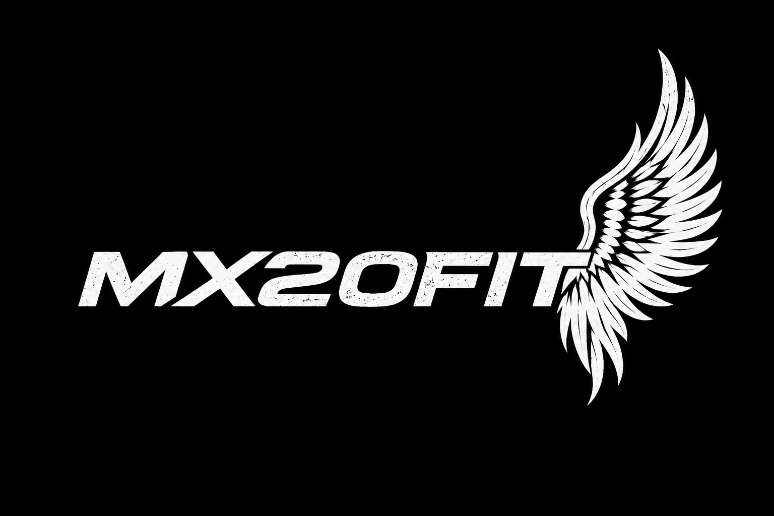
The wing represents, freedom confidence and the drive to rise beyond limits. As MX20FIT’s signature symbol, it creates a recognizable identity that stays consistent across every collection while allowing colors, styles and designs to evolve.
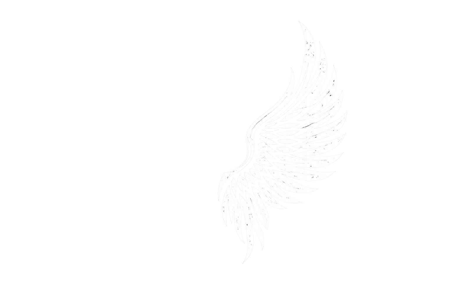
The wing is designed to become a recognizable symbol of MX20FIT beyond the wordmark itself. As with iconic brands that can be identified by a signature graphic alone, the goal is for the wing to represent MX20FIT wherever it appears immediately.
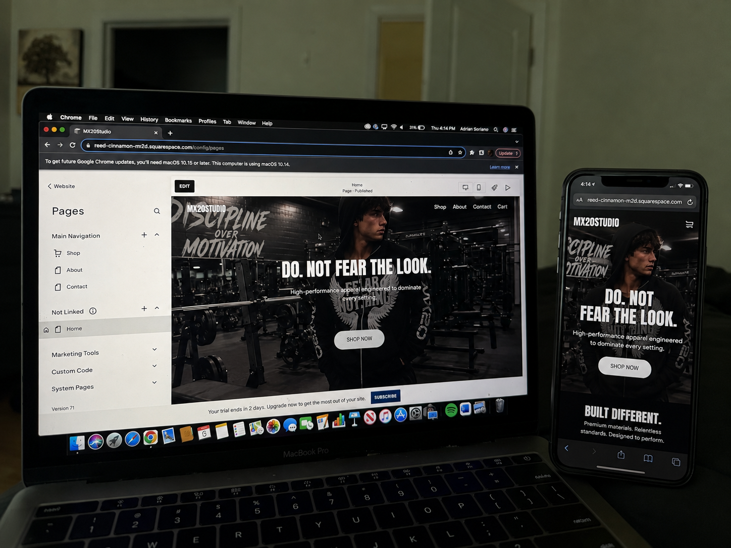
02 / WEBSITE